Marketing
Preparing Marketing Materials: Graphics
October 11, 2021• min
We fall in love with our eyes. Images are easier for our brains to digest, and we make image-based decisions faster than those based on text.
For this very reason, it is crucially important that your game looks good to potential customers. Their first impression isn’t usually the description or the advertising slogan, it’s a picture. And you won’t get a second chance to make that first impression.
Attractive graphic assets will significantly increase the odds of that customer buying your game. A poor or hastily-done image will reduce those odds. So, let’s talk about graphic assets and what the modern market dictates.
 Symbol logos use an image to represent a brand. If your game is dedicated to World War II tank battles, a tank silhouette in the logo would be fitting. If you develop match-3 about funny kittens, a trio of furry faces will hint at the game’s genre.
 Combined logos mix the above two options. If you’re not sure that the name of your game or company is enough to communicate the right message, consider adding relevant imagery alongside the text.
Whatever type of logo you choose, the following principles apply.
Combined logos mix the above two options. If you’re not sure that the name of your game or company is enough to communicate the right message, consider adding relevant imagery alongside the text.
Whatever type of logo you choose, the following principles apply.

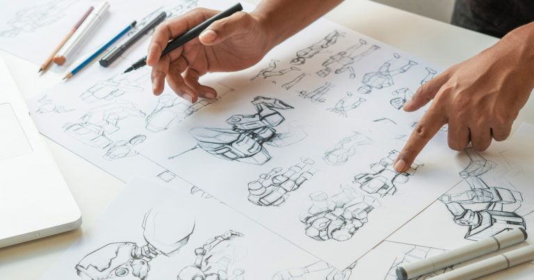
 Artwork
The artwork is the ‘’face’’ of your project. It will grace the game page, decorate your presentations, and stare out at the audience from magazine covers if you’re lucky. It will also serve as an invaluable source of material for banners.
It has often been said that artwork that can’t be cut into a couple dozen banners is bad artwork. There are several parameters that game artwork must meet, including the following:
Artwork
The artwork is the ‘’face’’ of your project. It will grace the game page, decorate your presentations, and stare out at the audience from magazine covers if you’re lucky. It will also serve as an invaluable source of material for banners.
It has often been said that artwork that can’t be cut into a couple dozen banners is bad artwork. There are several parameters that game artwork must meet, including the following:


 Be sure your artwork reflects the habits and perceptions of your target audience. Bright, rich colors and pastoral motifs are suited for the casual farm games whose main audience is 35+ women. Strict lines and dark tones fit for zombie survival games played by teenagers. Keep these principles in mind when commissioning an artist.
Where can you get art?
It’s great if you already have a high-level professional artist on your team who can create the artwork of your dreams. In this case, time is the only thing that you will need. Typically, the artwork takes two weeks to two months to complete, depending on the professionalism of the artist, the complexity of the task, and the number of edits.
If your team is devoid of artists, then you’ll have to turn to a third-party. It’s up to you whether you choose one of the numerous outsourcing studios or find an artist on ArtStation. The studios are a safer bet as far as results go but come with a higher price tag. In addition, they are interested in getting the job done as quickly as possible, so each requested edit will increase your budget.
You can find affordable deals by working with freelancers but there’s a risk that you’ll be left without any art or face delays.
Choose your option based on your task and budget. On average, the price of game art starts at $1,200 and can easily go up to $10,000 for complex art from a famous artist.
Ensure the Art Meets Your Expectations
Break the work into several stages. In the event that you are working with an outside specialist, tie the payment to the completion of project stages, like the ones listed below.
Be sure your artwork reflects the habits and perceptions of your target audience. Bright, rich colors and pastoral motifs are suited for the casual farm games whose main audience is 35+ women. Strict lines and dark tones fit for zombie survival games played by teenagers. Keep these principles in mind when commissioning an artist.
Where can you get art?
It’s great if you already have a high-level professional artist on your team who can create the artwork of your dreams. In this case, time is the only thing that you will need. Typically, the artwork takes two weeks to two months to complete, depending on the professionalism of the artist, the complexity of the task, and the number of edits.
If your team is devoid of artists, then you’ll have to turn to a third-party. It’s up to you whether you choose one of the numerous outsourcing studios or find an artist on ArtStation. The studios are a safer bet as far as results go but come with a higher price tag. In addition, they are interested in getting the job done as quickly as possible, so each requested edit will increase your budget.
You can find affordable deals by working with freelancers but there’s a risk that you’ll be left without any art or face delays.
Choose your option based on your task and budget. On average, the price of game art starts at $1,200 and can easily go up to $10,000 for complex art from a famous artist.
Ensure the Art Meets Your Expectations
Break the work into several stages. In the event that you are working with an outside specialist, tie the payment to the completion of project stages, like the ones listed below.
 To emphasize the importance of screenshots, CD Projekt RED made “Screenshot Specialist” an official position when working on The Witcher: Wild Hunt. This specialist had to make the best images to meet the marketing goals of the project. This can be much more complicated than it seems as only one out of 200 images meet all the requirements for a good screenshot.
The requirements are as follows:
To emphasize the importance of screenshots, CD Projekt RED made “Screenshot Specialist” an official position when working on The Witcher: Wild Hunt. This specialist had to make the best images to meet the marketing goals of the project. This can be much more complicated than it seems as only one out of 200 images meet all the requirements for a good screenshot.
The requirements are as follows:
 Spend ample time preparing your screenshots. Do your best to find perfect angles and game moments. Keep in mind, these screenshots will provide the user with their first impression of your game so make sure they will like what they see.
Special Assets
Each platform has a set of special assets that are used for your game page. For instance, Capsule Images for Steam and Brand Banners for the App Store. Their main task is to highlight your game among similar games, and in certain cases, to serve as advertising assets.
Special assets are made from artwork such as logos, so the only advice we can give is to follow platform guidelines. Apple has released its guide in the form of a comic strip. Make sure that the style of such assets matches the general style of your graphic assets.
Spend ample time preparing your screenshots. Do your best to find perfect angles and game moments. Keep in mind, these screenshots will provide the user with their first impression of your game so make sure they will like what they see.
Special Assets
Each platform has a set of special assets that are used for your game page. For instance, Capsule Images for Steam and Brand Banners for the App Store. Their main task is to highlight your game among similar games, and in certain cases, to serve as advertising assets.
Special assets are made from artwork such as logos, so the only advice we can give is to follow platform guidelines. Apple has released its guide in the form of a comic strip. Make sure that the style of such assets matches the general style of your graphic assets.
Main Types of Graphical Assets
Graphical assets are the materials that allow you to create the desired impression of your project. Depending on your marketing goals, the end result can be anything from enticing users to buy to wishlist products to registering for beta tests, subscribing to your newsletter, or simply clicking a banner. The ultimate goal is, of course, to make a sale. But there are steps to getting there. The first task of any marketing asset is to get attention. Your goal is to make the player focus on a screenshot or pick your icon from a huge list of icons on a store page. Here’s what we suggest as a bare minimum of graphical assets for a game:- Game logo
- Icon
- Artwork
- Screenshots
- Specialized store page assets (Steam, Google Play, EGS, etc.)
Symbol logos use an image to represent a brand. If your game is dedicated to World War II tank battles, a tank silhouette in the logo would be fitting. If you develop match-3 about funny kittens, a trio of furry faces will hint at the game’s genre.
Combined logos mix the above two options. If you’re not sure that the name of your game or company is enough to communicate the right message, consider adding relevant imagery alongside the text.
Whatever type of logo you choose, the following principles apply.
- Simplicity. You do not need to design fancy monograms or obsess about tiny details. The logo should be easy to read and memorable. Avoid any unnecessary elements. Look at the logos of the greatest companies out there, they’re usually deceptively simple.
- Individuality. This is a rare case when it’s a bad idea to copy successful peers. You have to find a way to stand out and make your logo different from the logos of your competitors.
- Attractive appearance. If your game tells the story of a mutant cockroach in the abandoned Pripyat, that doesn’t mean you should have a cockroach head in your logo. Alternatively, if you develop a survival game set in a zombie apocalypse, don’t use an open skull with brain fragments and a large tablespoon as your logo. These examples may sound oddly specific, but both were real prototypes for game logos. The developers wisely went with other options. Long story short, your logo should be attractive and inoffensive at the very least.
- Protectability. Yes, yes, boring legal stuff. But believe us, you’ll be better off spending several hundred dollars to protect your logo. Otherwise, you run the risk of having to go to court to prove that you were the first party to use your logo. This is because there are patent trolls out there who track successful projects looking to take advantage of the legal system. The legal costs you can encounter will make you regret that you did not register your logo in advance.
- The game logo and the game icon are not the same things. The requirements for a small image on the screen of your phone or a Steam page differ drastically from the requirements for logos. The game icon should primarily convey the essence of the game and not its name.
- Do not use words in your icon. Seriously! By trying to put your game’s name into the icon you are eliminating at least a third of the image. Nobody will be able to read it, and you will deprive the image of compositional harmony. The only exception would be using the word and nothing else, but that’s risky.
- The game name should correlate with the icon. If the game is named ‘’Arkham Nightmares’’ but the icon shows a pink-cheeked girl, the dissonance will confuse users.
- The ideal icon would make use of a key character or scene. Take a look at the following example. It communicates the game’s setting, main character, and the fact that the cute yellow guy will engage in a lot of combat.
- Keep it simple. Do not load the icon with several objects, details, or multi-color rendering. The concept’s originality is way more important. You’ll be better off using 3-4 colors and concentrating on one object.
- Evaluate what has been done before. Research your competitors’ icons. This could help you see how you can stand out among the competition or give you the inspiration to make the correct choice for your game.
- Testing is especially important for icons. Make sure to develop different versions of your icons and survey people using A/B tests. There are many platforms that can help with testing. SplitMetrics or StoreMaven are two paid options. There are also built-in testing mechanisms on Google Play. Remember that this testing can be vitally important for the success of your game.
- Change the design from time to time. Everything becomes outdated, and the user’s eye can eventually become blind to your icon. To avoid this, you should periodically change the design. It would be best to do this along with the release of an update or a large patch. It is important to maintain the style so that your icon can still be recognized as the game the player has come to love. Take a look at the example below:
Artwork
The artwork is the ‘’face’’ of your project. It will grace the game page, decorate your presentations, and stare out at the audience from magazine covers if you’re lucky. It will also serve as an invaluable source of material for banners.
It has often been said that artwork that can’t be cut into a couple dozen banners is bad artwork. There are several parameters that game artwork must meet, including the following:
- First of all, the artwork should show the main character(s) of the game. In the event that your game does not have clearly defined characters, the artwork should contain an image of a key object or scene. Eye-catching images are a must.
- Your artwork should reflect the marketing angle you want to take with your game. If you are making a game about the bloody adventures of a marine who is accompanied by thousands of demons, your artwork should contain a marine or a demon, and ideally both.
- Have a consistent message. If you are labeling the game as a ‘’zombie apocalypse survival simulator’’ but your artwork depicts well-fed, happy characters with fresh make-up and elegant machine guns then you are sending the wrong message.
- Artwork should also take into account the characteristics of the different markets. For example, if you develop a strategy game based on World War II, the perception of your artwork will vary from country to country, depending on the nation’s historic role in that conflict.
Be sure your artwork reflects the habits and perceptions of your target audience. Bright, rich colors and pastoral motifs are suited for the casual farm games whose main audience is 35+ women. Strict lines and dark tones fit for zombie survival games played by teenagers. Keep these principles in mind when commissioning an artist.
Where can you get art?
It’s great if you already have a high-level professional artist on your team who can create the artwork of your dreams. In this case, time is the only thing that you will need. Typically, the artwork takes two weeks to two months to complete, depending on the professionalism of the artist, the complexity of the task, and the number of edits.
If your team is devoid of artists, then you’ll have to turn to a third-party. It’s up to you whether you choose one of the numerous outsourcing studios or find an artist on ArtStation. The studios are a safer bet as far as results go but come with a higher price tag. In addition, they are interested in getting the job done as quickly as possible, so each requested edit will increase your budget.
You can find affordable deals by working with freelancers but there’s a risk that you’ll be left without any art or face delays.
Choose your option based on your task and budget. On average, the price of game art starts at $1,200 and can easily go up to $10,000 for complex art from a famous artist.
Ensure the Art Meets Your Expectations
Break the work into several stages. In the event that you are working with an outside specialist, tie the payment to the completion of project stages, like the ones listed below.
- Terms of reference. Communicate the basic requirements: composition, colors, and style. Make sure to attach several examples of similar work so the artist can understand the style that you want from him. Give the artist as much information as possible about your game so that he can grasp its spirit and atmosphere.
- Sketch approval. Based on your initial requests the artist will make their first drafts, schematically showing the main elements, composition, and object sizes. At this stage, you can suggest the first changes as this does not require significant effort or costs.
- Color palette. The approved sketch will then be painted with basic colors so that you can evaluate whether the tone meets your expectations.
- Drawing art. Once the composition is approved, the main drawing can start. You may still make suggestions for minor cosmetic changes that the artist can take into account for the final stage of the work.
- Polishing the art. Shadows, tiny details, and finishing touches.
To emphasize the importance of screenshots, CD Projekt RED made “Screenshot Specialist” an official position when working on The Witcher: Wild Hunt. This specialist had to make the best images to meet the marketing goals of the project. This can be much more complicated than it seems as only one out of 200 images meet all the requirements for a good screenshot.
The requirements are as follows:
- Each screenshot should display a “juicy’’ moment of gameplay.
- The screenshot should be easily understood and its essence is clear at first glance.
- The screenshot should not contain technical errors, artifacts, or missing textures. It should be an ideal picture of the game.
- The screenshot should be graphically filled with no “blind spots”. A screenshot in which the character is doing something in one corner while the remaining space is occupied by the sky and desert is bad, even if you have the best sky and desert in the industry.
- It should show what your game is about.
- The screenshot must stand out among other images and attract attention.
- The screenshot needs to show your game in the most favorable light.
Spend ample time preparing your screenshots. Do your best to find perfect angles and game moments. Keep in mind, these screenshots will provide the user with their first impression of your game so make sure they will like what they see.
Special Assets
Each platform has a set of special assets that are used for your game page. For instance, Capsule Images for Steam and Brand Banners for the App Store. Their main task is to highlight your game among similar games, and in certain cases, to serve as advertising assets.
Special assets are made from artwork such as logos, so the only advice we can give is to follow platform guidelines. Apple has released its guide in the form of a comic strip. Make sure that the style of such assets matches the general style of your graphic assets.
Asset List
Working with graphic assets can be difficult. Not only are there many of them to develop and keep track of, but they also cannot be released sequentially. You should start working on your artwork two months before you need it and start preparing the logo and screenshots as soon as possible in order to get all these materials ready on time. To avoid forgetting anything, create a special asset list. This will specify all the graphic assets you’ll need, as well as deadlines, responsible persons, and necessary comments. Some people choose to do this in Excel, others have used Google Docs or a board in Trello. The main thing is to make sure you have a list to help navigate the asset chaos.Conclusion
The creation of graphic assets is a difficult task at the very beginning. However, you’ll soon grow accustomed to it once you learn the rules and pitfalls. Since you’ll be regularly creating icons and screenshots, you’ll soon learn to craft them with ease. Before you know it, players will be falling in love with your game. Featured articles


Contact us
Talk to an expert
Ready to maximize revenue opportunities? Reach out to our experts and learn how to start earning more and spending less.